Nieman Foundation at Harvard
Why is all the news so negative?
Maybe it’s because journalists are naturally drawn to aberrations — outliers from the norm — and those tend to be more bad than good. After all, a flight landing safely isn’t a story, but one crashing into the ocean sure is.
Maybe it’s because reporters see themselves as watchdogs, tasked with identifying malfeasance, corruption, discrimination, and other social problems that need fixing. A government program working well isn’t as exciting as a mayor taking money under the table.
Heck, maybe it’s because the world is just inherently a dark and depressing place — a theory the past decade or so seems ready to endorse.
Or maybe it’s because it sells. News publishers, as rational economic actors, want to maximize the audience for everything they do, and there’s something about the negative lens on reality that draws eyeballs to copy.
Those suspecting that last culprit find support in a new study just published in the journal Nature Human Behavio(u)r. The title says it all: “Negativity drives online news consumption.”
Online media is important for society in informing and shaping opinions, hence raising the question of what drives online news consumption. Here we analyse the causal effect of negative and emotional words on news consumption using a large online dataset of viral news stories.Specifically, we conducted our analyses using a series of randomized controlled trials (N = 22,743). Our dataset comprises ~105,000 different variations of news stories from Upworthy.com that generated ∼5.7 million clicks across more than 370 million overall impressions.
Although positive words were slightly more prevalent than negative words, we found that negative words in news headlines increased consumption rates (and positive words decreased consumption rates). For a headline of average length, each additional negative word increased the click-through rate by 2.3%. Our results contribute to a better understanding of why users engage with online media.
So: Add a negative word to your headline — words like harm, heartbroken, ugly, troubling, angry — and get 2.3% more clicks, on average. And adding a positive word — like benefit, laughed, pretty, favorite, kind — does the opposite and keeps people from clicking.
The paper is by Claire E. Robertson, Nicolas Pröllochs, Kaoru Schwarzenegger, Philip Pärnamets, Jay J. Van Bavel, and Stefan Feuerriegel — variously of NYU, University of Giessen, ETH Zurich, LMU Munich, and Karolinska Institutet.1 And it builds upon a well-known phenomenon — a bias toward negativity that shows up not just in news consumption, but across all sorts of information-seeking behavior.
As Baumeister et al. put it in an oft-cited paper 20 years ago: Bad is stronger than good. In evolutionary psychology terms: “A person who ignores the possibility of a positive outcome may later experience significant regret at having missed an opportunity for pleasure or advancement, but nothing directly terrible is likely to result. In contrast, a person who ignores danger (the possibility of a bad outcome) even once may end up maimed or dead.” Being vigilant against novel threats let our ancestors pass more of their genes into the next generation.
In the context of media research, this concept is often called surveillance, a term popularized by Harold Lasswell. (Not in the CIA/FBI/NSA sense of the term.) People consume news media to learn of any new threats — and to be at least somewhat comforted that the absence of alarming headlines meant the world is moving along as planned. As Gay Talese wrote in The Kingdom and the Power, some 20th-century readers saw The New York Times “as necessary proof of the world’s existence, a barometer of its pressure, an assessor of its sanity. If the world did indeed still exist, he knew, it would be duly recorded each day in The Times.”
So it’s not as if this paper reveals some previously unknown secret sauce to attract human attention. But it’s able to quantify the effect in a precise way because of an unusually rich dataset dating to the early days of viral social media.
Remember Upworthy? Yes, it’s still around — but its imperial phase came circa 2013-14, when it zoomed out of relative obscurity to become one of the biggest websites on the internet. Upworthy understood three things about social media — in particular, Facebook — that made them traffic monsters:
Some randomly chosen examples: “Here’s The Moment A Black Woman Protected A White Man At A KKK Rally.” “This Ad From India Shows Men Exactly How Creepy They Are When They Stare At Women On The Street.” “This Guy Needs A Clue: A Member Of The 1% Declares It ‘Great’ That 3.5 Billion Are In Poverty.” “Bully Calls News Anchor Fat, News Anchor Destroys Him On Live TV.” “Gap Went For Fairer Pay Even Though The Rest Of The Country Wasn’t Really Doing It? Cool.”
Most importantly, they aimed to create what they termed a curiosity gap — teasing an emotional reward that can only be achieved by clicking through. I mean, You May Not Even Realize You’ve Done It! Sometimes the emotional reward is framed in the headline writer’s own voice: “I Love This Bollywood Star’s Approach To Dealing With Questions About What Being Gay Means.”
Among the wisdom within: “You HAVE to crap out 25 headlines for every piece of content. You WILL write some really stinky headlines. Once you start getting desperate, you start thinking outside the box…#24 will suck. Then #25 will be a gift from the headline gods and will make you a legend.”
Upworthy routinely A/B tested multiple headlines on the same story — showing each version to a small share of website visitors, tracking which one attracted the most clicks, and then shifting to the winner from there on. (You could more properly call it A/B/C/D testing — an average of 4.3 headlines were tested per story.)
This data-rich approach meant that Upworthy had what amounted to thousands of natural experiments in digital news user behavior, including real-world results. All that data, from 2013 to 2015, has been given over to researchers in the form of the Upworthy Research Archive. (Much appreciation to Nate Matias et al. for acquiring and setting up all that data.)
That’s the universe of clicks that this paper is examining. It’s massive, as the abstract says: more than 105,000 headlines for more than 22,700 different Upworthy stories, which drew 5.7 million clicks from 370 million impressions. So while there are caveats to note — 2013 is a couple centuries ago in internet time, for one — the data is robust at a scale we rarely see in news research.
A few takeaways:
The median clickthrough rate on the headlines measured was 1.07%. The average rate was 1.39%, a number skewed by a small number of huge hits. Ninety-nine percent of all headlines had a CTR of less than 6%.
A content analysis found that 2.83% of all words in the headlines were “positive” words in their categorization scheme, versus 2.62% which were labeled “negative.” Some examples:
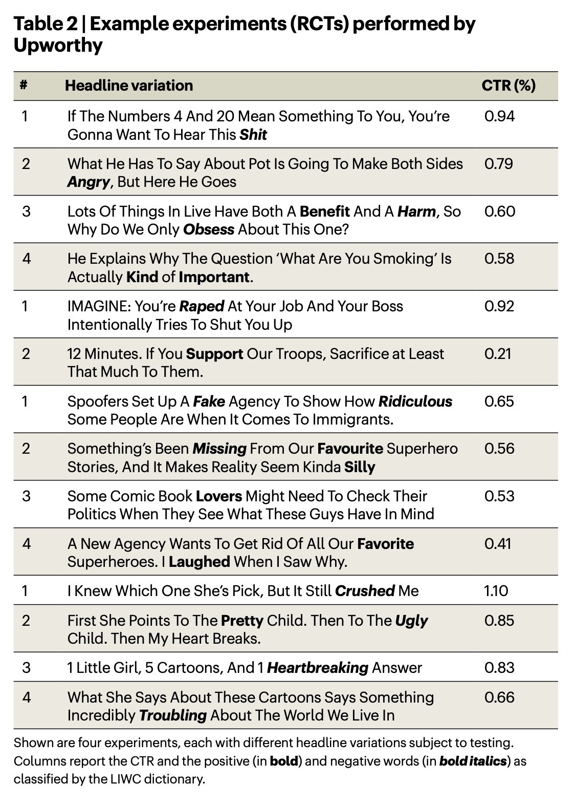
The presence of each type was found to correlate with a meaningful change in clickthrough rate:
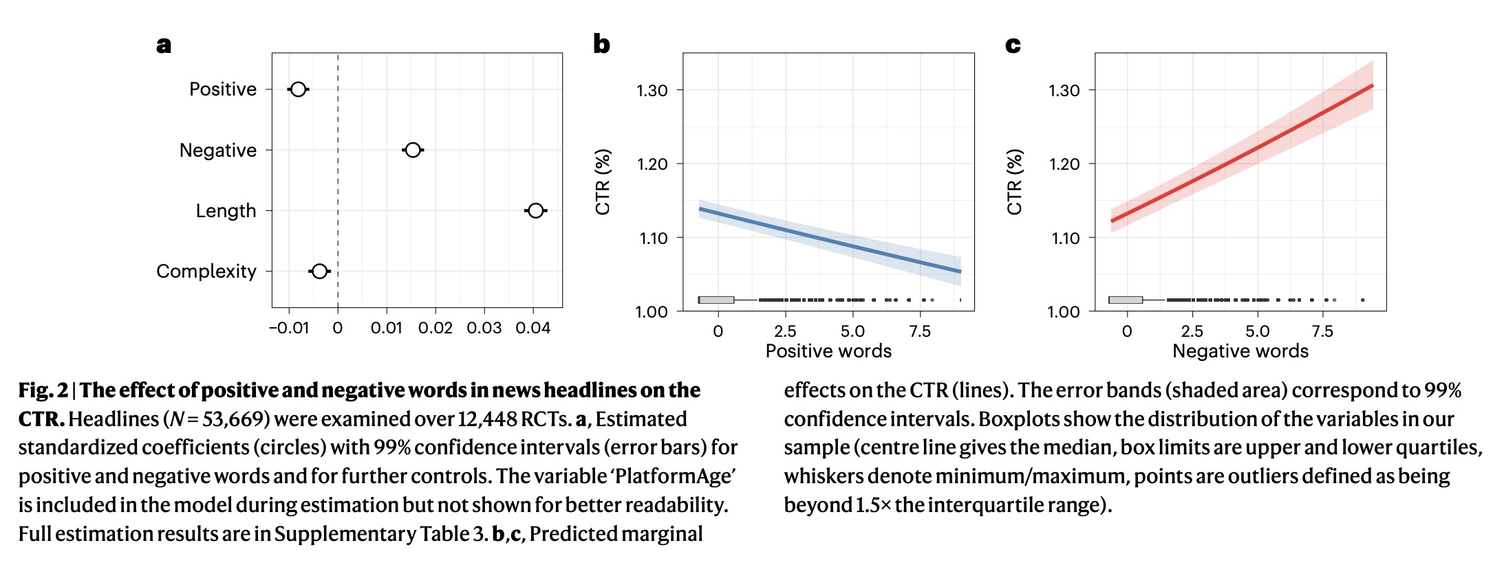
Consistent with the ‘negativity bias hypothesis’, the effect for negative words is positive (β = 0.015, SE = 0.001, z = 17.423, P < 0.001, 99% CI = (0.013, 0.018)), suggesting that a larger proportion of negative words in the headline increases the propensity of users to access a news story. A one standard deviation larger proportion of negative words increases the odds of a user clicking the headline by 1.5%. For a headline of average length (14.965 words), this implies that for each negative word, the CTR increases by 2.3%.In contrast, the coefficient for positive words is negative ( = −0.008, SE = 0.001, z = −9.238, P < 0.001, 99% CI = (−0.010, −0.006)), implying that a larger proportion of positive words results in fewer clicks. For each standard deviation increase in the proportion of positive words per headline, the likelihood of a click decreases by 0.8%. Put differently, for each positive word in a headline of average length, the CTR decreases by 1.0%.
Notably, the effect of both positive and negative words declined over time; they were more potent in Upworthy’s earliest days, when its headline tricks were new. As other publishers learned from them — and as the public got sick of them — readers became less likely to be moved into or out of action by a stray word.
These effects are not enormous. (To be clear, those changes are expressed as percentages of the clickthrough rate, not percentages of overall impressions. So a 2% increase in CTR would take a 1% CTR to 1.02%, not to 3%.) As you can see in this chart, a typical clickthrough rate for a headline with 0 negative words would be about 1.13%; for a headline with 5 negative words, it’d be about 1.22%.
That said, even small changes in clickthroughs are likely to also generate small changes in sharing behavior — and that increased sharing could easily amplify headline effects to a larger audience.
The authors ran a variety of robustness checks. For instance, some of the tests also involved changes to the image that accompanied the story; the results were the same whether or not they ignored those tests. The effect sizes were larger on some types of stories than on others — negative words were especially attractive in headlines about politics, for instance — but the basic directionality was unchanged.
Perhaps the most surprising finding to me was a breakdown of the effects of different kinds of positive and negative words.
Previous work has suggested that certain discrete emotions such as anger may be particularly prevalent in online news. Furthermore, discrete emotions were found to be important determinants of various forms of user interactions (for example, sharing), thus motivating the idea that discrete emotions may also play a role in news consumption.We report findings from four emotions (anger, fear, joy, sadness) for which we found statistically significant positive correlations between the human judgments of emotions and the dictionary scores. We observed a statistically significant and positive coefficient for sadness (β = 0.006, SE = 0.001, z = 5.295, P < 0.001, 99% CI = (0.003, 0.009)) and a statistically significant negative effect for joy (β = −0.009, SE = 0.001, z = −7.664, P < 0.001, 99% CI = (−0.012, −0.006)) and fear (β = −0.007, SE = 0.001, z = −5.919, P < 0.001, 99% CI = (−0.009, −0.004)).
A one standard deviation increase in sadness increases the odds of a user clicking the headline by 0.7%, while a one standard deviation increase in joy or fear decreases the odds of a user clicking on a headline by 0.9% and 0.7%, respectively. The coefficient estimate for anger (β = 0.000, SE = 0.001, z = −0.431, P = 0.666, 99% CI = (−0.003, 0.002)) was not statistically significant at common statistical significance thresholds.
Headline words associated with sadness increased clicks. Headline words associated with joy and fear reduced clicks. And headline words associated with anger had no statistically significant effect.
That’s fascinating, and unexpected — both for me and for the authors, who expected anger, fear, and sadness to all increase clicks. This is an area where I wonder about the age of the data; in this angrier political era, would anger drive more clicks than it did during the relative (relative!) calm of the second Obama administration?
And if we are to believe “Bad is stronger than good” derives from evolutionary psychology — that it arose as a useful heuristic to detect threats in our environment — why would fear-related words reduce likelihood to click? (The authors hypothesize that fear and anger might be more important in generating sharing behavior — which is public-facing — than clicks, which are private.)
In any event, this study puts some hard numbers to what, in most newsrooms, has been more of an editorial hunch: Readers are more drawn to negativity than to positivity. But thankfully, the effect size is small — and I’d wager that it’d be even smaller for any outlet that decided to lean too far in one direction or the other.
A full-on Debbie Downer approach is unlikely to be a metrics winner. But if want to try it out, be my guest. (You Won’t Believe What Happened Next.)


